purchase process redesign
in-house designer & developer at TicketBiscuit LLC
The ticket-buying interface remained largely unchanged since the TicketBiscuit platform was developed in the early 2000s. Users had to click through anywhere from four to six pages before completing their transaction. The UI was initially created by back-end developers and was largely table-based. I was tasked with simplifying this process and modernizing it in both form and function without losing any functionality or disorienting returning users.
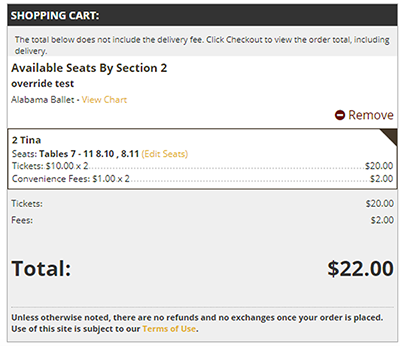

examples of components before my update
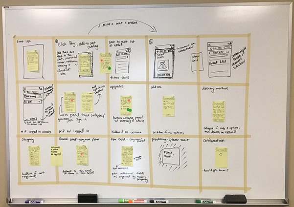
The team shut ourselves in a conference room for a week and went through a condensed design sprint. We went over our current process, researched trends and competitors, and came up with extensive notes and sketches. We created personas representing various types of our users so we could address each of their needs as we made UI decisions.
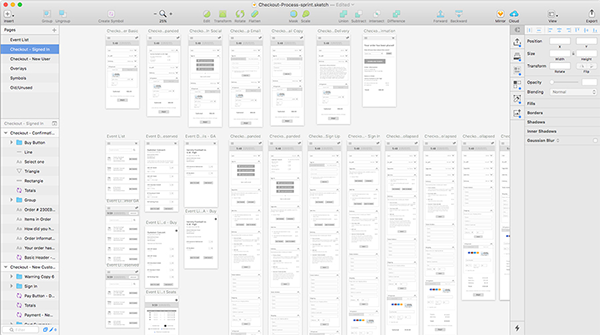
I created some rough grayscale wireframes to show the basic functionality. When we agreed on that, I added color and iterated through hundreds of screens to nail down a design. I then used those to create detailed interactive InVision prototypes for mobile and desktop to use for testing.
Once the design was approved, I worked with back-end developers to bring it to life. I started by building styles and static HTML elements, which my coworker then replaced with dynamic C#. I also added scripts to enhance interactions: animating changes, using HTML5 input types, implementing front-end validation, and masking input fields.
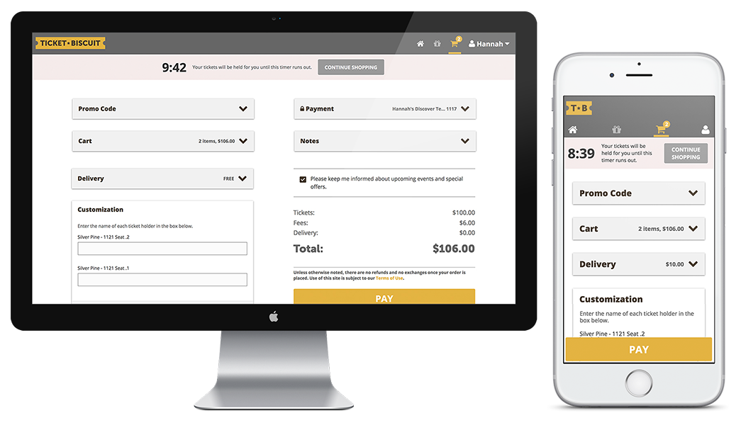
I decided on a card-based layout to allow modernization of the UI while preserving the modular nature of the existing components. Each card is collapsible and displays a summary of its information when collapsed. Cards that need user input are automatically expanded when going to checkout, while those that don't are collapsed by default. This means returning users can get to the checkout page, review the information on their collapsed cards, and click pay in a matter of seconds.
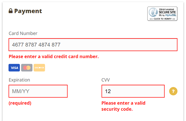
I looked at our analytics to determine which browser versions we should support and what features could be integrated. Since about 55% of our users access the site via mobile device, I focused on mobile optimization. This page is form-heavy, so I implemented changes to make filling out these forms easier for our users. HTML5 input types trigger the correct keyboard on mobile devices, while input masking makes input data easier to scan. I applied masking to the credit card number, expiration date, CCV code, phone number, and postal code fields as well as instant front-end validation for these and all required elements. Since we have some customers outside the US, phone number and postal code field validation patterns are dynamic based on the selected country. The form supports validation for the US, Canada, and the UK.
Back-end developers implemented my new total cost design that updates automatically based on decisions made in the checkout cards. I also made the ticket purchase timer more conspicuous so it didn't get lost on the page and created a new, separate cart page that can be accessed outside the purchase process. Since the screen can become very long on mobile, I made the pay button float near the bottom of the screen so it's always within reach. Lastly, I used some jQuery and CSS3 transitions to animate interactions for a smoother user experience.
more than 30% increase in conversion rates, from 16.5% to 21.58%
maximum six pages condensed into one, reducing clicks and tech debt
sub-minute purchase times for the first time since the company began